Case study · Napkin Scores
A small app with its own look, finished properly
Napkin Scores is a score pad for card nights on Android and iOS. It's small on purpose: two screens, no sign-in, no ads, no analytics. It's also the kind of app agencies get asked for every week, and it got the same release discipline as the big ones.
- 75 linesof platform-specific code; everything else is shared Kotlin
- 8ready-made scorecards, from Flip 7 and Qwirkle to Skull King and Golf
- 0data collected: the App Store privacy label reads Data Not Collected
- 2 storesfrom one codebase, with App Review's questions answered on a real iPhone
The brief
- Instantly useful at a real card table: pick it up, seat the players, start scoring.
- A look nobody would mistake for a stock app.
- Bring players to Diamond Tabletop without getting in the way of keeping score.
What I built
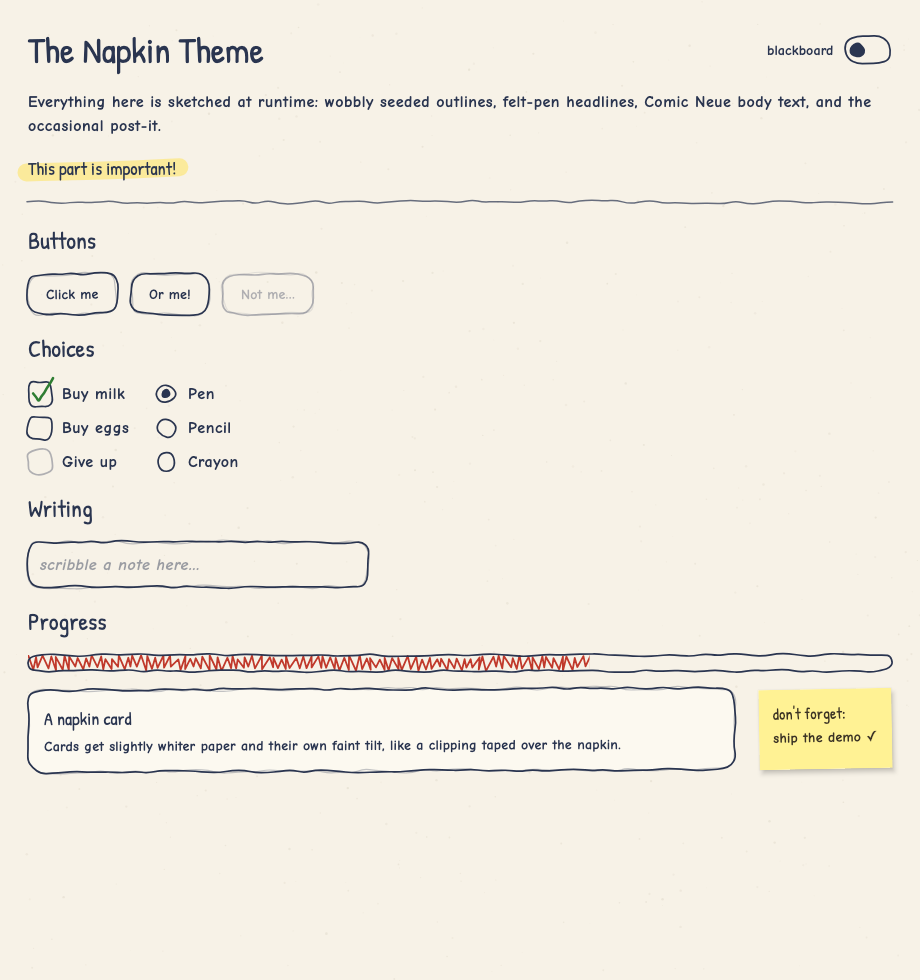
- The look first, as a library. Napkin is a Compose Multiplatform theme in which every Material 3 component is sketched at runtime. Each outline is drawn from a seed, so it wobbles like a pen line but stays put between frames. I open-sourced it.
- Design that carries meaning. Each player writes in their own pen colour, and that colour follows their seat everywhere: the seating list, the column header, every round and the running total. The leader's total is circled in their pen, the way you'd circle it on paper. Beyond that, colour stays rare, so it means something when it appears.
- Features for the regulars. Saved game types with the right win direction and end condition, and recent games that re-seat the same players in one tap.
- Reuse instead of rewrite. It's built on the same shared modules as Diamond Tabletop. Sharing a recommendation goes through the same code the games use for invites, so the feature added no platform code at all.
- The release work nobody sees. The privacy label backed by an empty privacy manifest. App Review's questions answered with evidence from a real iPhone. A reproducible App Store build, store screenshots captured by script, and on Android, an invite link that survives the trip through the Play Store install.
A feature I didn't build
An iOS App Clip would let someone at the table use the score pad without installing anything. I measured it first: a clip is capped at 15 MB, and this app's iOS binary is 31 MB, almost all of it Compose itself. A clip would have meant a second score pad, written separately in SwiftUI, to maintain forever. Not worth it, so it isn't there.
Small apps go wrong by growing. Keeping one small is a series of decisions like this one, made with numbers rather than enthusiasm.
What this could look like for you
-
An agency with a client who wants an app
Your client's brand built once as a Compose theme and used on both platforms, then shipped to both stores under your client's accounts, with App Review handled. I work under your brand and never contact your client.
-
A brand that has to look like itself
If your product has a distinctive look, it can be a theme library your team owns and reuses in the next app, not a set of one-off screens.
-
Privacy as a selling point
An app that collects nothing, and a store label that can honestly say so. I'll tell you which features and SDKs cost you that label before you add them.
-
A small app with a fixed date
A launch campaign, an event, a product announcement. Small and finished beats ambitious and late, and the release work is where small apps usually slip.
Have an app your client needs by a date?
Tell me the date you're working against. Thirty minutes, technical, no deck.